Case Study
Aamozish
A 12-step story of going zero-to-one building a modern, visually striking e-learning product teaching the Urdu calligraphic script.
Quick summary.
Led a 20+ member team in creating the product roadmap, guiding tech development, and directing product design and marketing, including curriculum development in accordance with the country’s top linguists.
Product Showcase Video
The objective.
Create a device-agnostic, self-paced learning product to teach writing in the calligraphic Urdu script in a gamified, visually-guided, media-rich format.
Requirements & challenges.
This is a highly complex undertaking rife with ambiguity and unique challenges posed by the script the language in which the language is written, in addition to tech hurdles such as web-based graphics rendering, browser support, and more as depicted below:
01. The “flowing” script
Urdu is written in the Arabic script flowing in a calligraphic cursive style, from right to left.
“Well, so is all of Arabic!”, you might say.
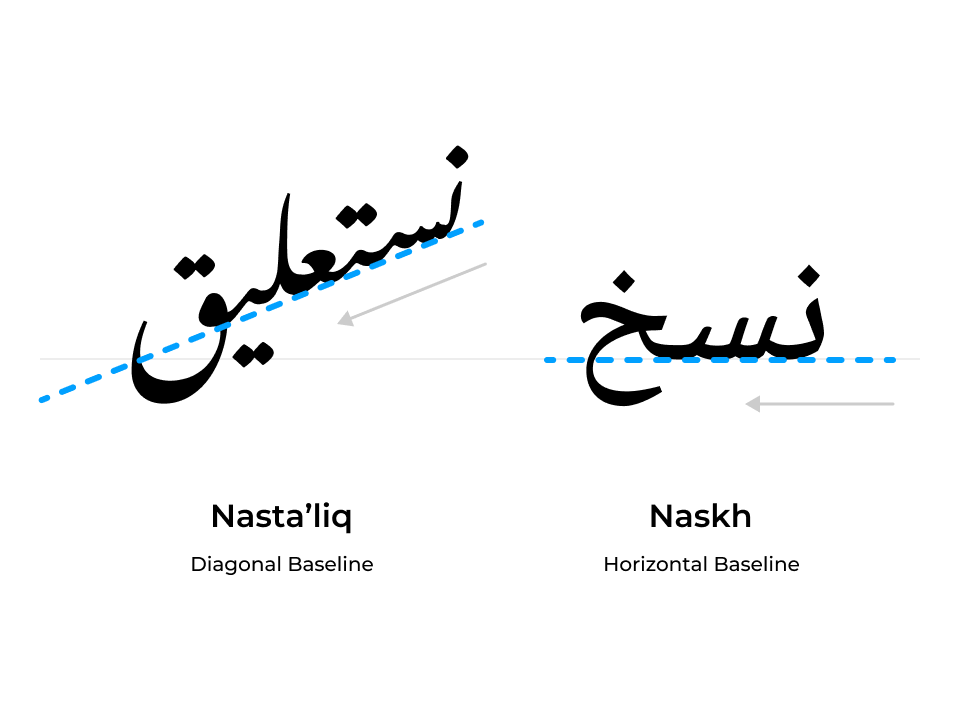
Yes, but not quite. Here’s where the first complex subtlety comes in: Urdu is written in a style called “Nastaliq” with diagonally shifting baselines. This is quite different from Arabic which is written in the “Naskh” style with a horizontal baseline.
02. Shape-shifting letters
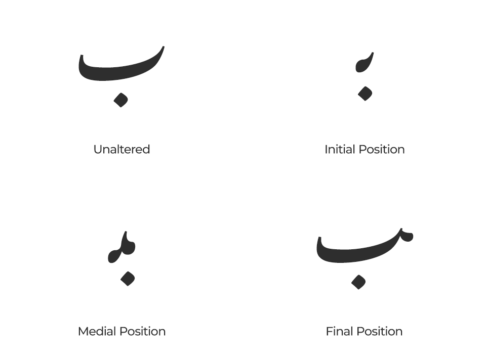
Owing to its cursive style of writing, letters in Urdu join together to form words unlike, for example—in typed English—wherein letters remain distinct.
And if that weren’t enough, letters change shape depending upon their position in a word!
03. Visual-izing the “writing”
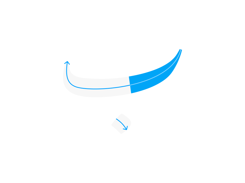
With the above challenges in mind, we now needed to figure out a scalable technical solution to “show” Urdu words “being written”.
Sure, one way would be to record videos. But how many? Till when? What happens every time a few new words get added to the curriculum’s library of words?
The initial process.
Step 1. Soul-searching
What’s the top imperative? Who is going to use this? And many other such questions needed answering when we started thinking about how to build this product.
Sure, we want people to “see” how Urdu is written, but how do we ensure their “first successes”, their “aha moments”, our stickiness?

It quickly became clear that true value for users lay, not in just seeing how to write, but in reading and forming their first words as quickly as possible.
Step 2. Researching font support
Unicode support for Urdu fonts, putting it mildly, wasn’t abundant at the time to cater to the complexities of the language and the features we were trying to build, limiting browser support and cross-compatibility.
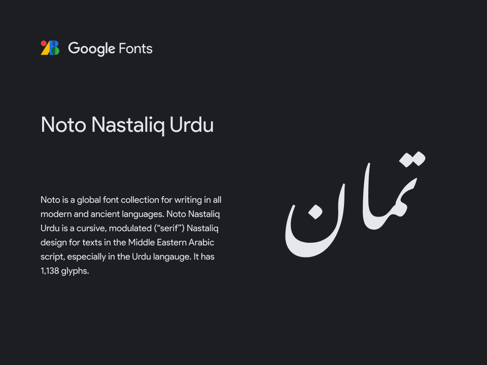
However, as I researched various methods of ensuring maximal support for font rendering, correctness, legibility, etc. I came across Google’s then recently launched Noto project which promised coverage for all the world’s languages. Instinctively, it felt like I’d struck gold.
Looking for Arabic script support I saw Noto supported both the Naskh and Nasta’liq styles. 🤩 🥳 🤩 🥳
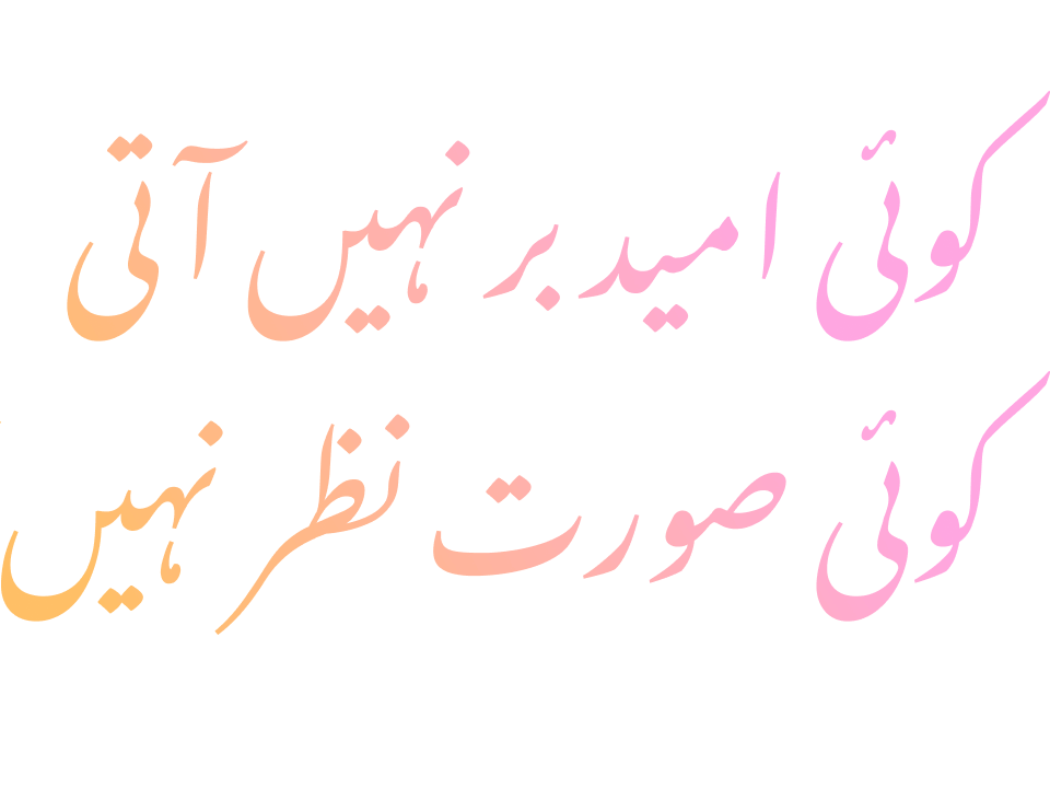
Step 3. Validating language support
It was time to put the font’s claim to the test, and more nervously, our joyous expectations.
And so, we passed existing Urdu text from our database to a test web page with Noto Nastaliq implemented. 🫣 😬
Barring a couple of bugs, because the font was still in beta, it worked! 😌
Step 4. Researching text animation methods
The next bit was to satisfy the “show how it’s written” requirement, and so my team and I researched methods to animate the “fill” inside a text string such that it would appear as if it were being written.
This led to the creation of our first assistive tool—an SVG-based text animator. While crude in its first iteration, it could “show” a small subset of simple letters being “written”.
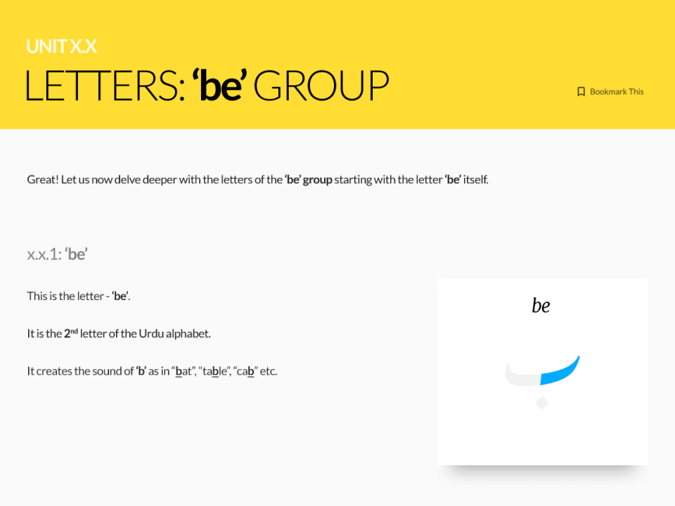
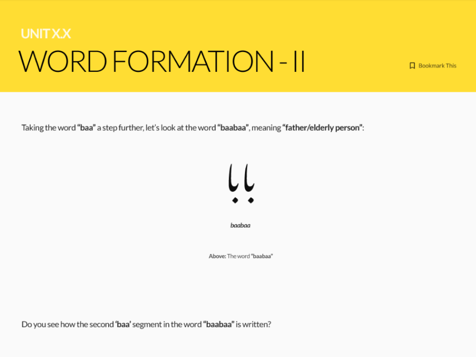
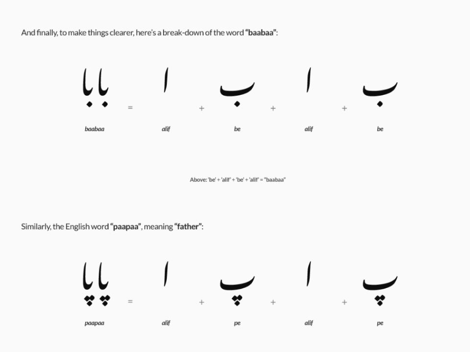
Hover over to pause or navigate
Step 5. A working prototype
While still far from an MVP, the team and I quickly moved to build a prototype for real-life user research bringing together some sample curriculum content, UI design, front-end engineering, and of course, implementing our shiny, new text animator.
Step 6. Qualitative research & expert review
With our first working prototype up and running, we invited our first cohort for user research: a few, renowned faculty members from Delhi’s best universities and institutes to see how they felt about the product vision and the prototype’s alignment with their decades of experience.

Initial feedback & insights.
The cohort’s general consensus was positive: The design of the product was conducive and viable, and so was the text-animator visual aid we’d developed.
The prototype had its first green light 🚦 ✅
However, we came across some really curious insights shared by our group of experts:
Pronunciation cues
“How are you going to ensure learners know the correct pronunciation?”
Dang! How did we overlook that?
You see, the Urdu language evolved to contain letters, and therefore, unique sounds from various languages such as Hindi, Arabic, Persian, and more. I mean, there are 4 letters in the alphabet for the ‘z’ sound alone! 😲
Transliteration
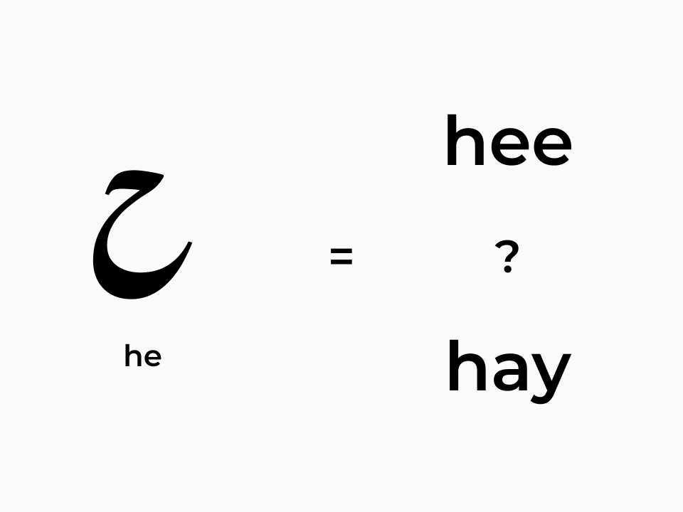
“How are you going to address sounds not found in the English diction?”
“What about non-Indian students already learning Hindi and wanting to learn Urdu next?”
Valid and tricky questions, both of them. This was yet another challenge to solve for and come up with a standardized way of expressing correct phonetics throughout the curriculum.
Visual “misunderstanding”
Okay, this one’s a real bumper: our research cohort educated us on a common behavioral aspect of learners during the initial phase of learning the language—one that we couldn’t have ever imagined:
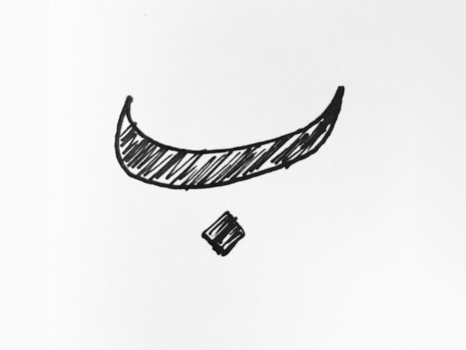
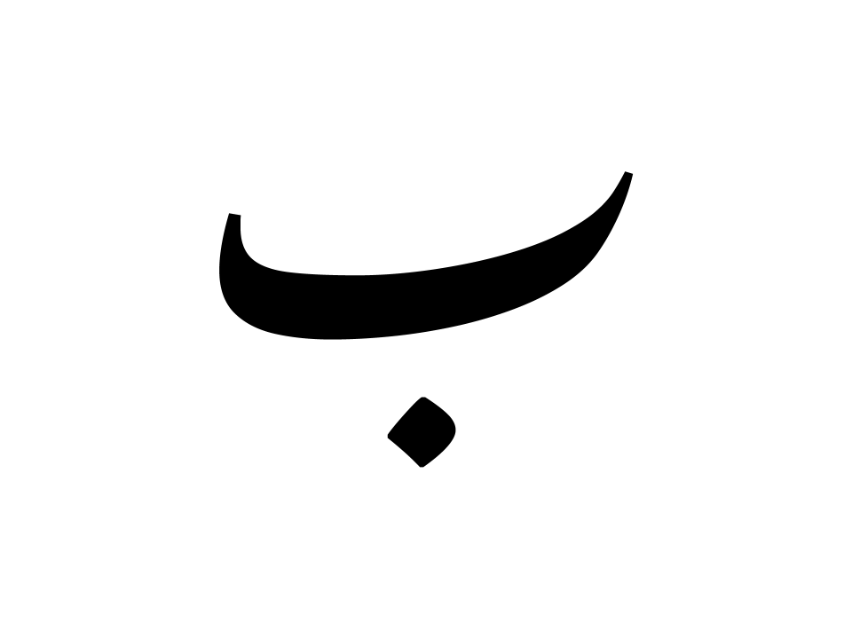
People look at the calligraphic letterforms in books, signage, packaging, etc., and assume that’s the way the language is written, and therefore, draw shapes and fill them in!
Imagine reading a brand name in English and then drawing it out with your pen every time you wanted to write a sentence with that name in it.
 Before
 After
After
The process, continues.
Step 7. Addressing pronunciation cues
I guided UI refinements to accommodate for audio to be plugged into various components and instances throughout the curriculum.
Later, I worked with radio personalities and my A/V team to record the immaculate pronunciation of hundreds of letters and words to be spliced and fed into the product.
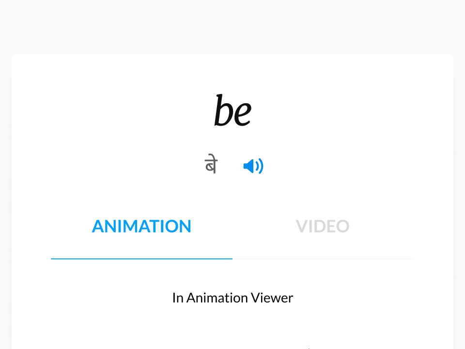
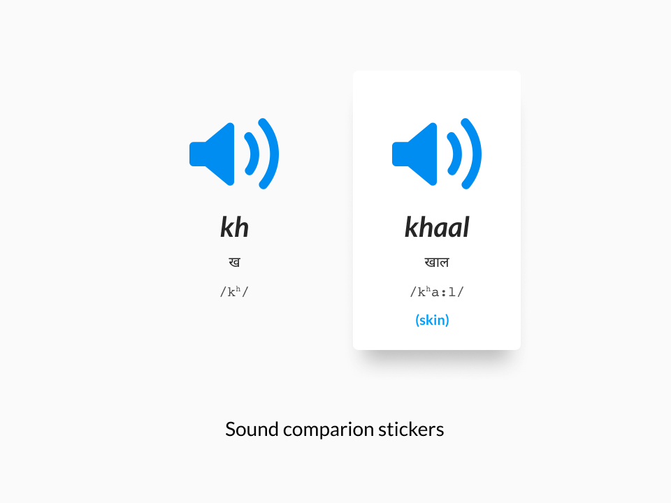
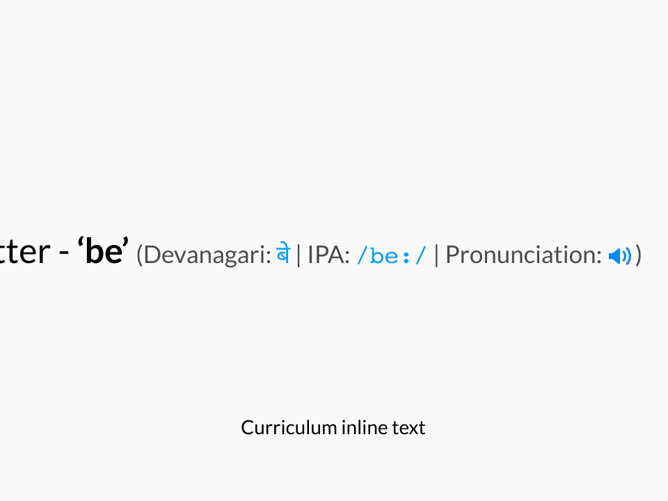
Hover over to pause or navigate
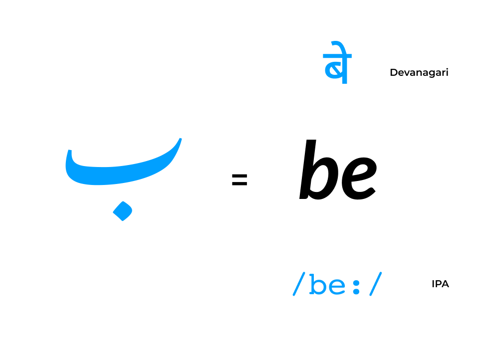
Step 8. Transliteration and IPA
We further added Hindi/Devanagari cues for students already familiar with Hindi and now learning Urdu.
Additionally, we incorporated textual cues written in the International Phonetic Alphabet or IPA.
We also standardized the transliteration of Urdu letters in the English alphabet. For this, I modified the English font we were using at the time and added several glyphs with diacritical marks and special symbols.
Step 9. Adding video clarifiers
Urdu letterforms’ calligraphic shapes are the result of writing with traditional “reed” quills. When written with an ordinary pen, the result is exactly what you’d expect when writing in any other language.
And so, to coach this effectively, we added video support in our SVG component container to show letters being written with both, a reed pen, and a felt-tip pen.
In the interest of sustainability and prioritization, we limited it to just the letters of the alphabet; the hypothesis being — If you can write a letter, you can write a book.
Feedback & insights: Round 2
Our MVP was ready, rich with freshly brewed features and a tonne of ‘v1’ curriculum content. And so, we turned to our trusty panel of experts for review.
How will the curriculum be structured?
Our panel of linguistic experts and scholars felt that while the product now had super-modern features and design, it probably didn’t need to stick to the traditional method of teaching going from A-Z.
That it didn’t fully align with getting people to read and form their first words as early as possible. Remember that top imperative?
How will learners be tested?
This question sounds like a micro-product in its own right with the ask being to incorporate quizzes, tests, score-keeping, and even certifications down the line.
Super valid input once again though, and so we went back to the drawing board.
More process-ing.
Step 10. Modernizing the curriculum
With the top priority in mind: Getting learners to read and form their first words as early as possible, we set out to revise our curriculum structure.
Sure, it took a few iterations and shuffling things about—bring short vowels and one of the last letters in first, move out the third letter group, etc.— but we finally got to a point where we could test it, and see positive results with a larger cohort with a mix of our target personas.
Step 11. Gamifying the learning
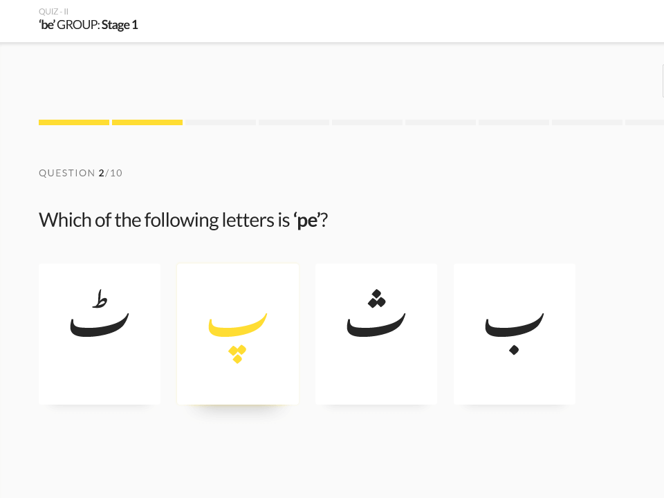
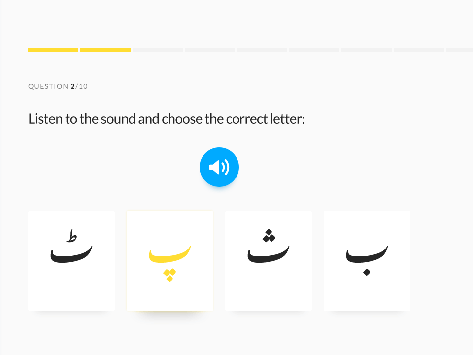
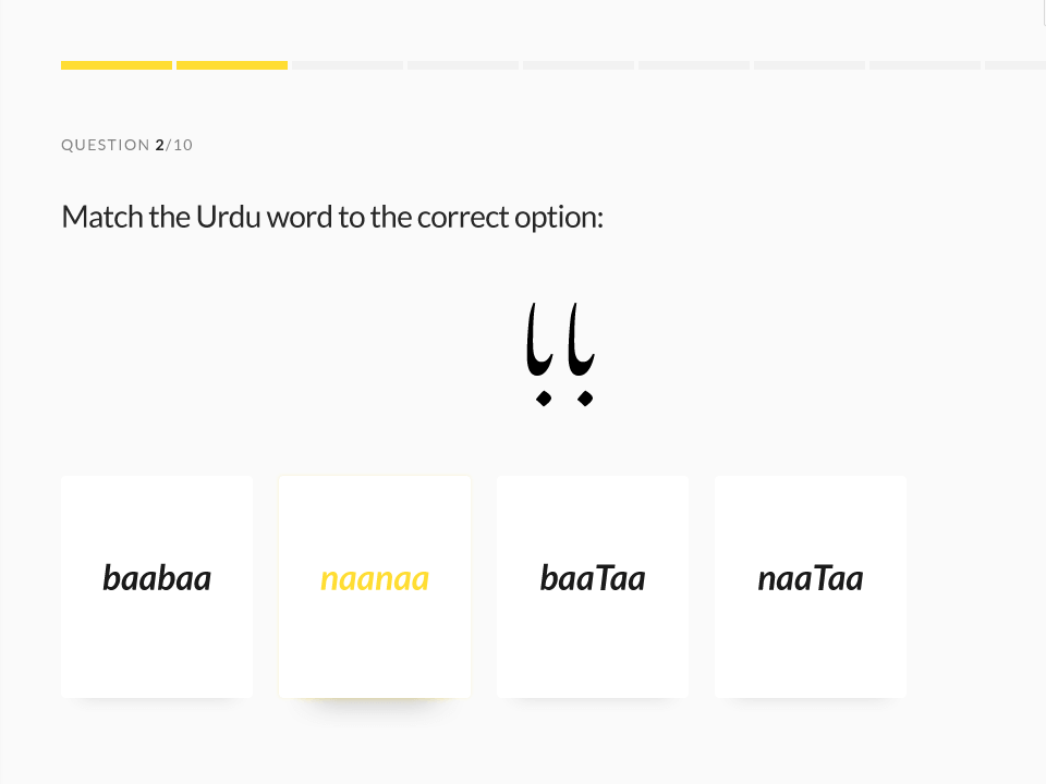
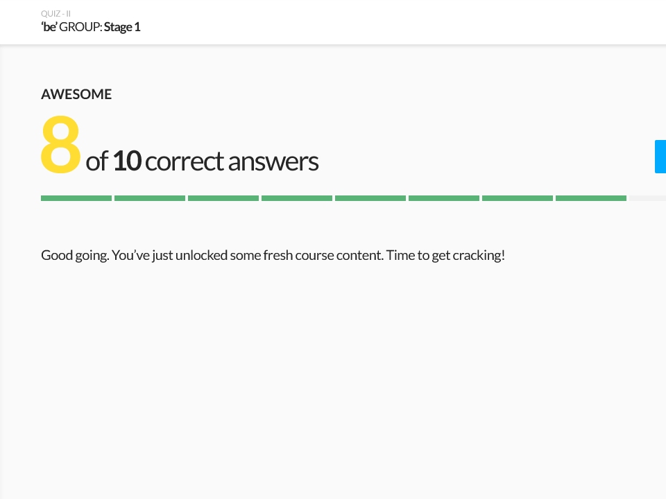
I guided the design and development of media-rich, interactive quiz module components to accommodate several different auditory and visual tests.
Once the components were ready, I had the content team work with select faculty members to develop a database of questions and answers to power the system.
Step 12. Tracking progress
To track individuals’ progress, we linked their activity to Rekhta World: Rekhta’s one-account system across all our products.
Learners could now view all the quizzes and tests they’d undertaken, how they’d scored, re-take tests, bookmark chapters and pages, and more.
And with all that built, we were now ready to go to market. A big win for the whole team 🤩
The results.
01.
The love and anticipation for the product were validated by the 3,000+ people signing up on day 1, growing consistently to stand at 352,000+ learners & counting.
02.
The product had to be device agnostic, available across the entire range of screens and connection speeds, remote mobile networks to broadband.
We saw usage aligned with our vision proven by the mobile-dominant MAU distribution.
03.
The engagement quotient of our curriculum, which was designed to be bite-sized and fast-moving, was proven by sessions lasting for more than 6 minutes on average: enough for a person to go through at least 2 pages of content and learn a few nifty tricks with the language.
