CASE STUDY
Chainstack’s Brand & Positioning Revamp
A story of transforming a web3 brand’s market presence from a challenger into a category leader and a teardown of its new positioning and visual language refresh.
Launched: 28 September 2023

“
Pulkit’s leadership in refreshing our marketing website was nothing short of transformative, turning it into a standout, engaging platform that significantly elevated our market presence.

Eugene Aseev
Founder & CTO - Chainstack
AT A GLANCE
Metric Improvements
* all growth organic, within 25 days post-launch
QUICK PEEK
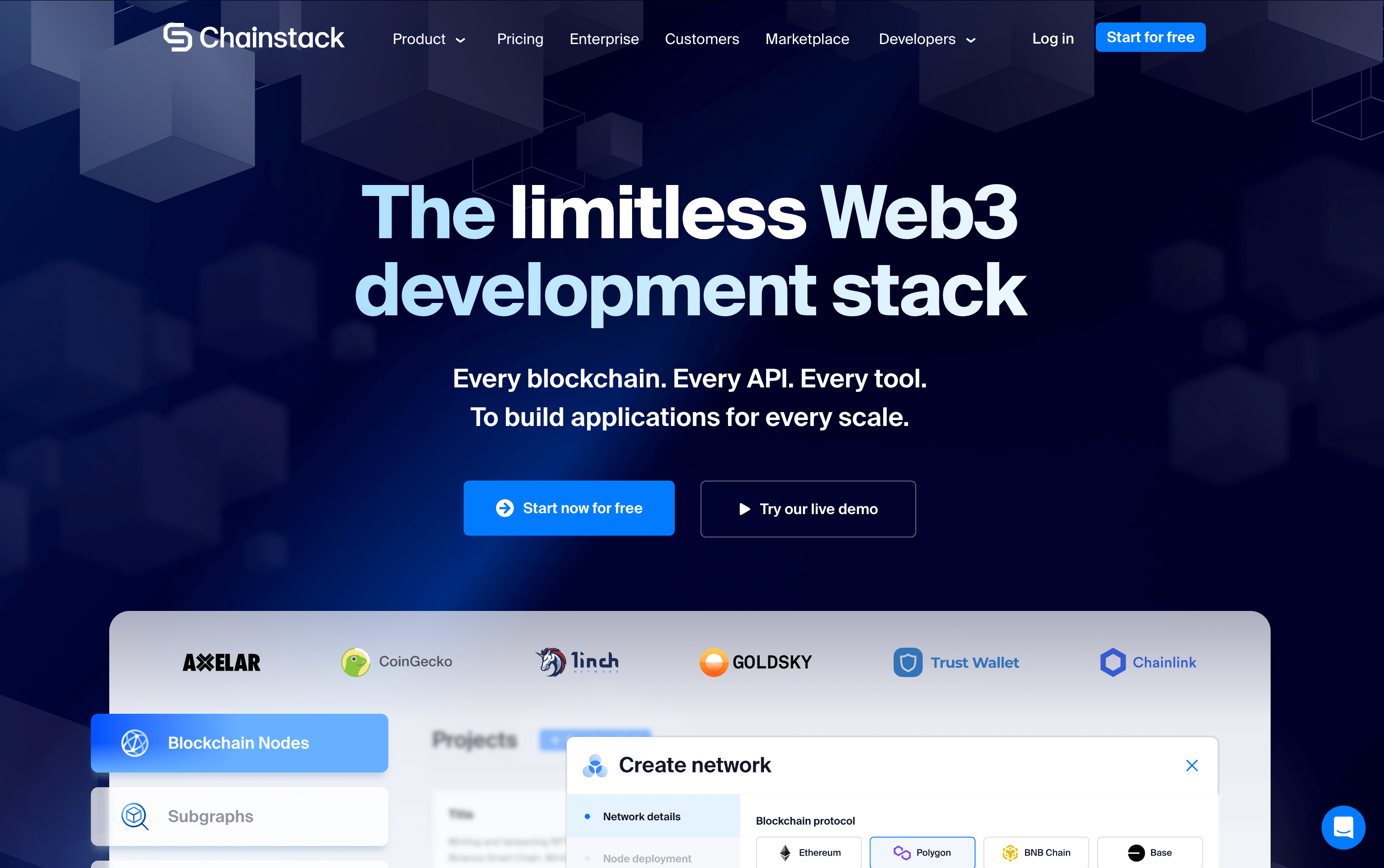
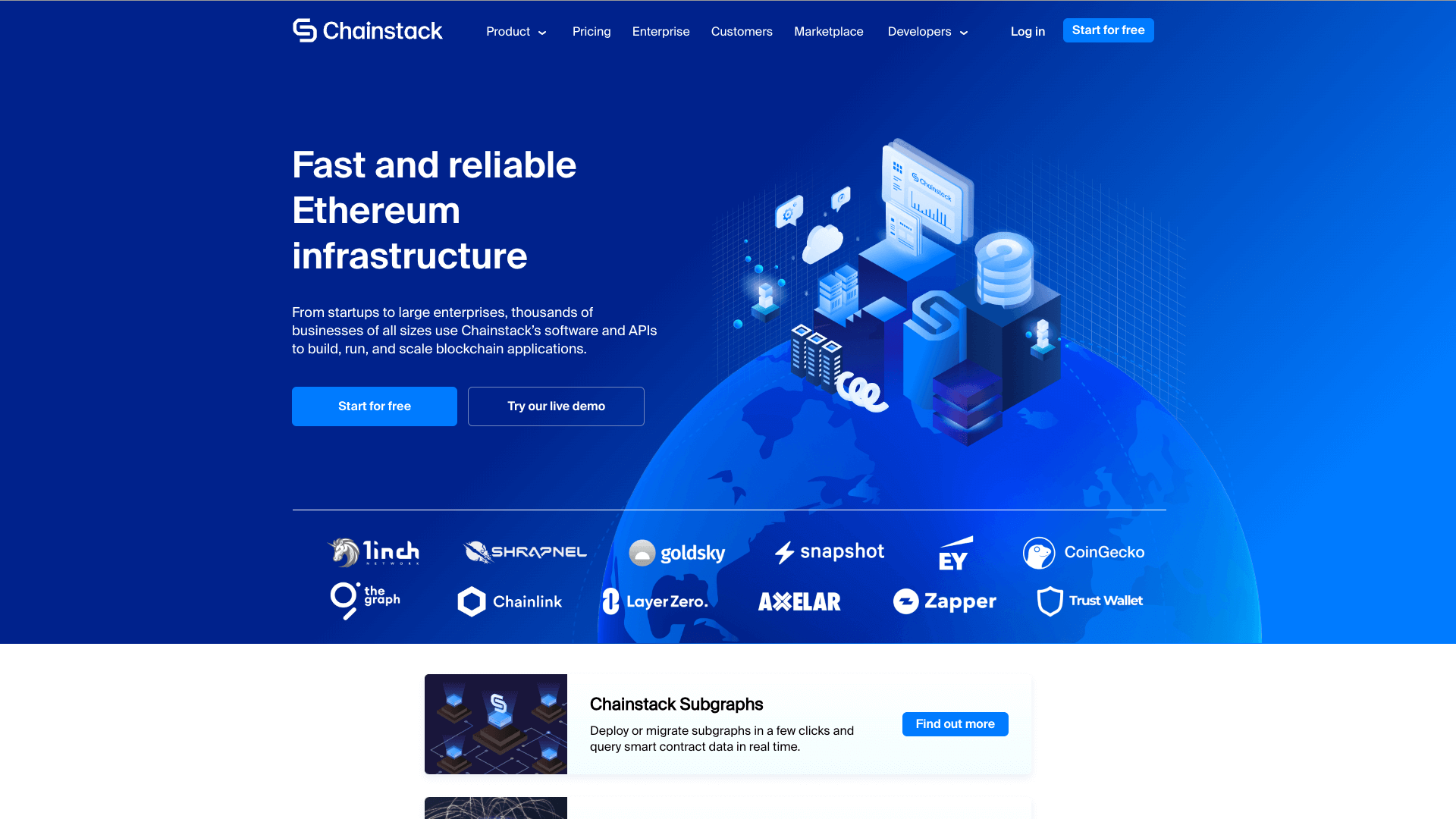
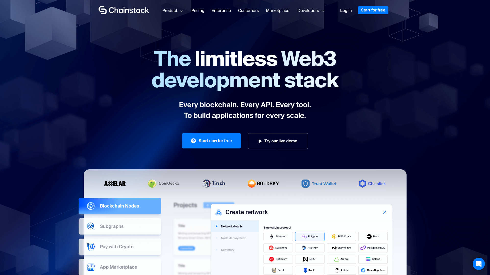
After vs. Before
Slide the marker to see the end result on the left versus the original on the right.
 Before
 After
After
Above: Interactive comparison showing clearer positioning and the product vs. the hero section before the rebrand
THE PROBLEM
01
It was difficult to understand at a glance the “what” and the “who”—Who Chainstack was and what they provided—a repeat concern highlighted by site visitors and prospects. And most visitors didn’t scroll past 30% of the page.
02
The headline and the sub-headline did nothing for the SEO. The headline rotated the blockchain name part between “Ethereum” and 25 others, while the sub headline was a paragraph of running text that usually went ignored.
03
Did not show the product! Which is still surprisingly okay in the B2B SaaS world. (Yes, you can see a button to view an interactive demo, but it was another battle unto its own. More on that later.)
04
The rest of the page did nothing to explain our differentiation, or showcase all the power-packed offerings being released continuously, or how we were a superior package overall, all the while being super text heavy.
05
The design language had fallen out of sync with the web3 industry—and even its biggest competitors—where bold colors and messaging, and larger-than-life, super-direct aesthetics were the status quo.
MY ROLE
01
I crafted and distilled the brand’s bold, new positioning that makes their product offering, differentiation (“limitless”), and philosophy (“Unlimiting the ways of Web3”) crystal-clear making it stickier, and easier to understand for prospects.
02
I also developed a new taxonomy & messaging framework that puts the brand’s name—“stack”—into action and permeates the entirety of the brand’s identity such as “Core Stack”, “Data Stack”, “Cloud Stack”, etc.
03
I directed the design and copy for the new homepage and a full visual language refresh surpassing the web3 status quo, and our biggest competitors in particular, who also went on to realign their visuals, messaging, and pricing almost overnight.
THE RESULT
And what the page does well now
01
What Chainstack is, its positioning, and its differentiation are now super clear—using as few words as possible to clarify “every” thing it provides for developers, i.e., “Every blockchain. Every API. Every tool. To build applications for every scale.”
02
Makes the Product the hero: Even if a visitor doesn’t scroll past the hero section, they know exactly what to expect from the product looking at the actual UI screen-grabs and the tabs on the left—Blockchain Nodes, Subgraphs, Web3 APIs, etc.
03
Flows like a Sales pitch and showcases Chainstack’s entire portfolio of offerings helping elevate the brand’s market presence with the new design while also pre-educating prospects making Sales calls more efficient.
A LITTLE 1-ON-1
Surpassing the Competition
Take a look at how our new positioning and visual language “stacked up” against some of our biggest competitors after the refresh.
As of 1 November 2023

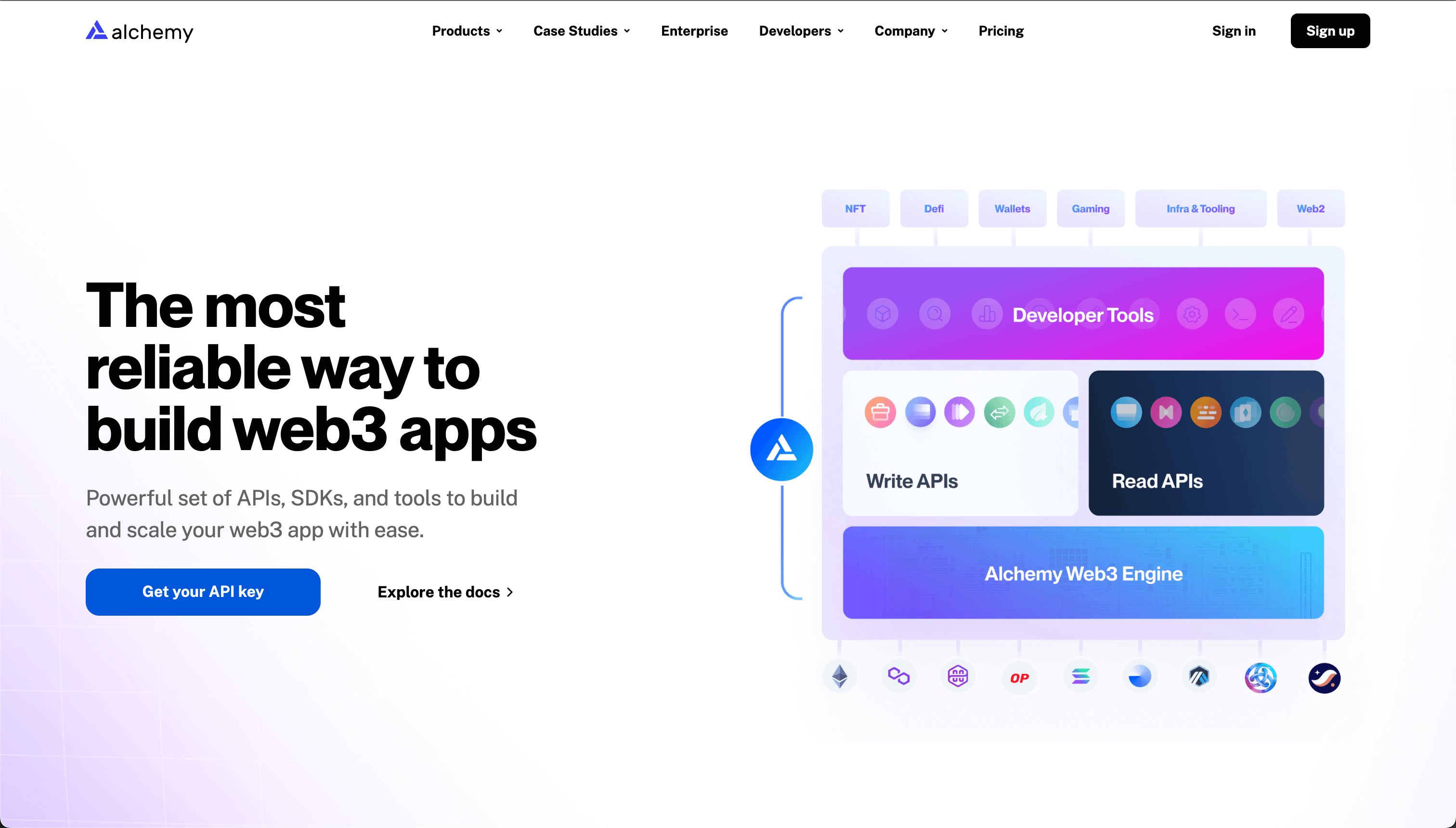
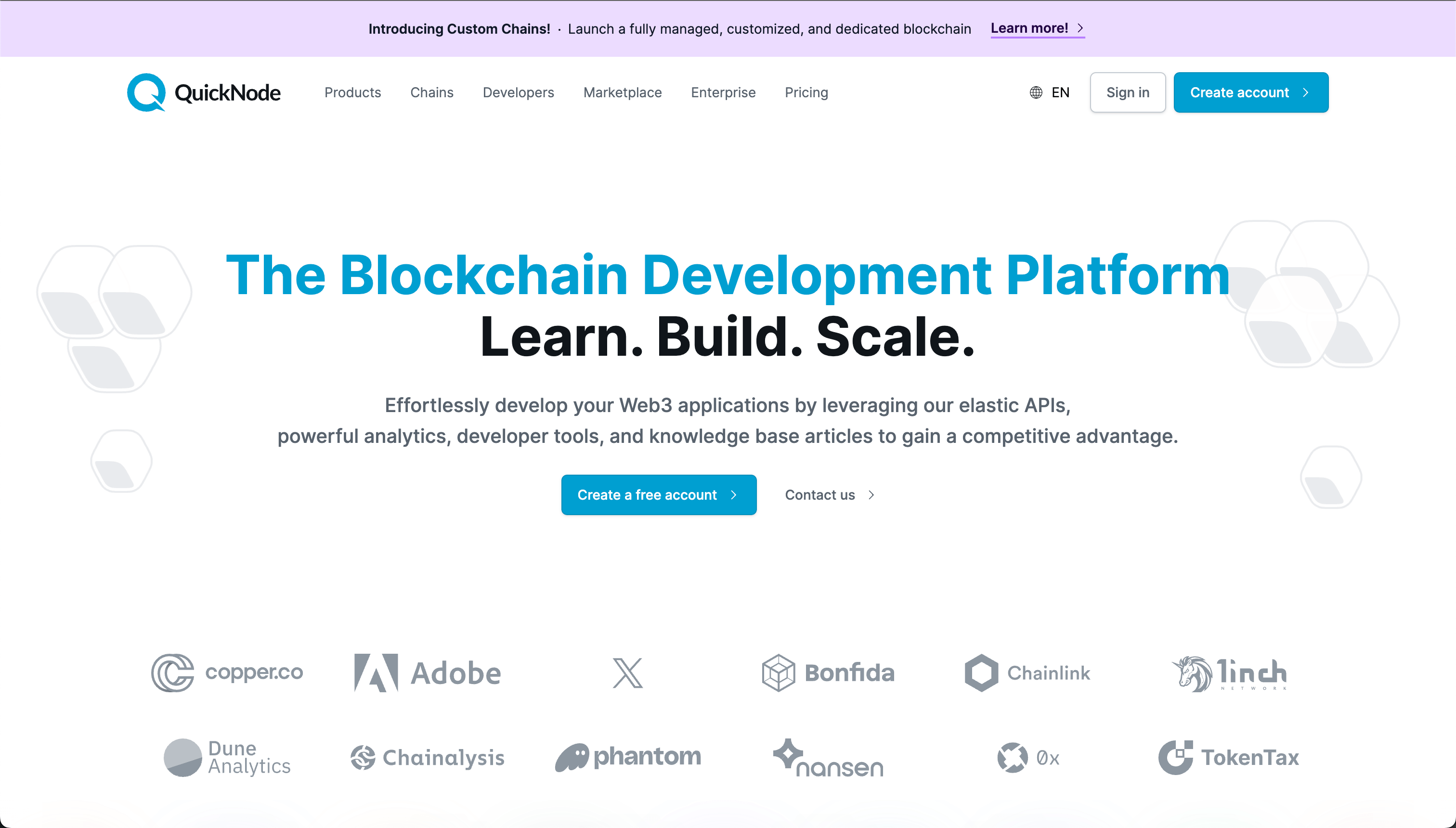
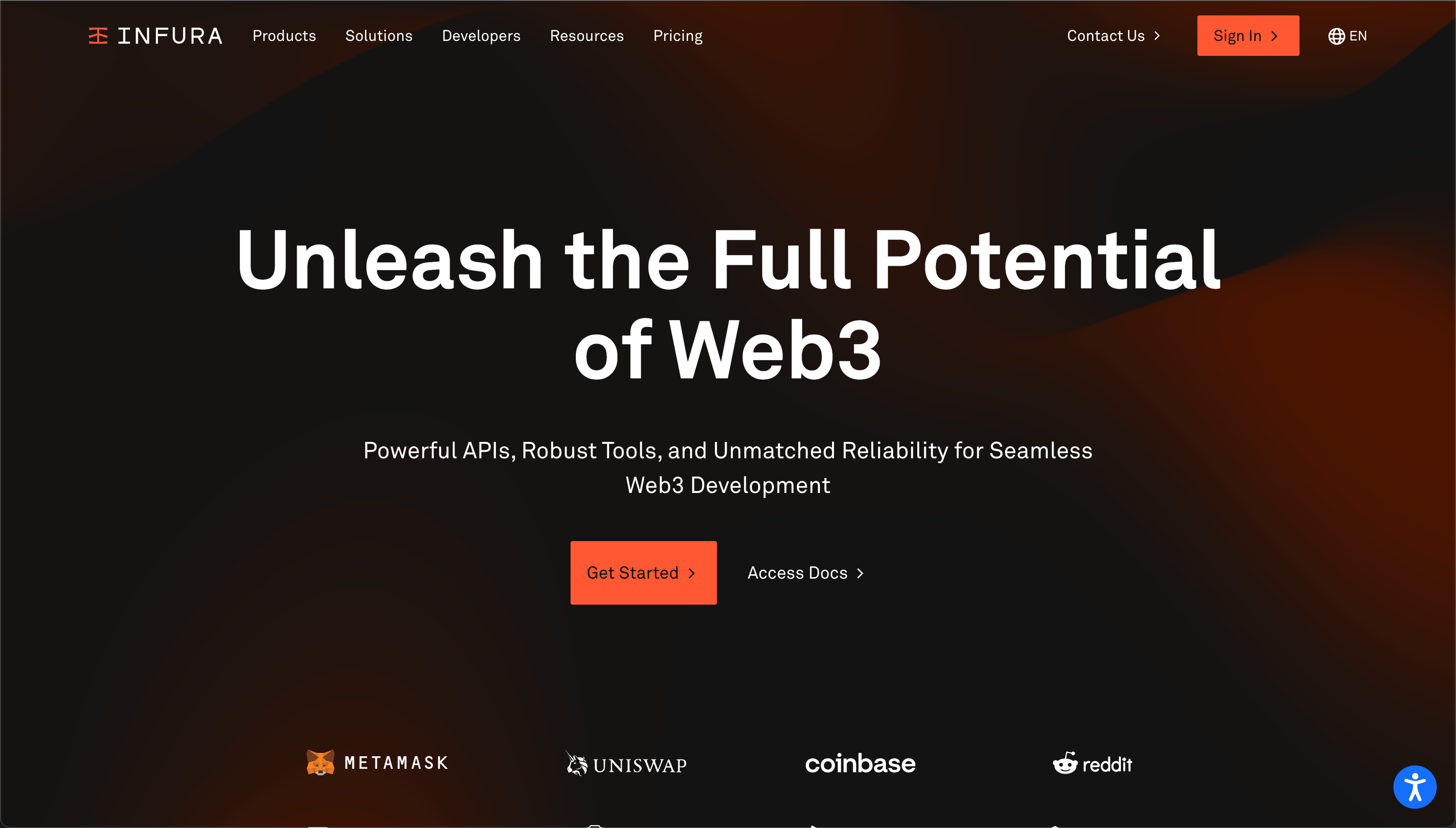


Above: Chainstack vs. Alchemy vs. QuickNode vs. Infura
TEARDOWN
The Process
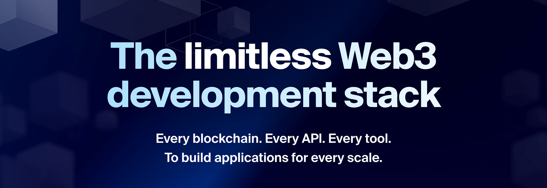
Defining the “What”
Clearly and objectively stating who we are and what we provide: A development stack for Web3 developers
The Differentiator
We are a “limitless” stack—a clear differentiator important for our ICP in terms of RPS limits (Requests Per Second) for API communication throughput.
“Stack”-ing it
Putting the brand name into action: We are a “stack”, while every single competitor likes to call itself a platform or a generic variant of it.
Clarity & Rhythm
Clearly stating exactly what we offer and for what purpose in the sub-heading.
STEP 1
Distilling the positioning
ICP
The Ideal Customer Profile in this case is (Web3) Developers, broadly speaking.
- From solopreneurs and small to mid-sized teams, to full-stack development teams at enterprise businesses
- Those who are cost-conscious yet absolutely require utmost flexibility and control over their web3 infrastructure and how it is set up
- Even moreso, those who’ve been burned previously by exorbitant invoices, and unpredictable costs and hidden charges from other infra providers
RESEARCH
What do customers & prospects really want?
During my conversations with existing customers, new site visitors and prospects via our live chatbot, and org-wide discussions with the C-suite, Sales & Accounts teams, Customer Success, and more; the following became abundantly clear:
- The first thing users like to check and confirm is if there are any Request Per Second (RPS) limits
- Users voice the need for their throughput, or RPS limit, to auto-scale during moments of challenging network traffic volume and handle burst loads
- Users voice the need for transparent and predictable billing
DISTILLATION
01
“The limitless Web3 development stack”
I distilled the research from my discussions with various stakeholders and the pain-points customers had voiced during our conversations, into a simple, sticky, memorable, 5-word positioning headline on the homepage incorporating:
- The differentiation: “limitless”
- The industry: “Web3”
- For what/whom: “development” / “developers”
- What it is: A “stack”, of development tools
02
Why “limitless”?
The headline anchors the brand narrative into being a flexible and performance-oriented service that does not impose artificial limits on throughput as it was critical for our ICP to be able to handle large API call volumes and burst loads without running into RPS limits, as has been the case with most web3 infra providers.
03
“Stack”-ing it
Differentiating ourselves further from the rest of the services calling themselves platforms, portals, and other such variants, we chose to simply put the brand name—Chainstack—into action by positioning ourselves as a “development stack”, instantly recognized and understood by our ICP—the developer community.
This also became a template for our service offerings’ taxonomy, as you’ll see later on within this case study.
04
Presenting our offerings with rhythmic clarity
And finally, we stepped away from using running, paragraph text to describe our offerings and instead, crafted a direct and objective rhythmic instrumentation with “Every blockchain. Every API. Every tool... for every scale.” to communicate what you, as a user, get with Chainstack.
This, too, became a template for positioning and describing other offerings in our portfolio. For example, look at our new Enterprise page with its sub-header that reads: “One provider. One interface. One invoice...”. More on this coming soon.
STEP 2
Making the hero section “work it”
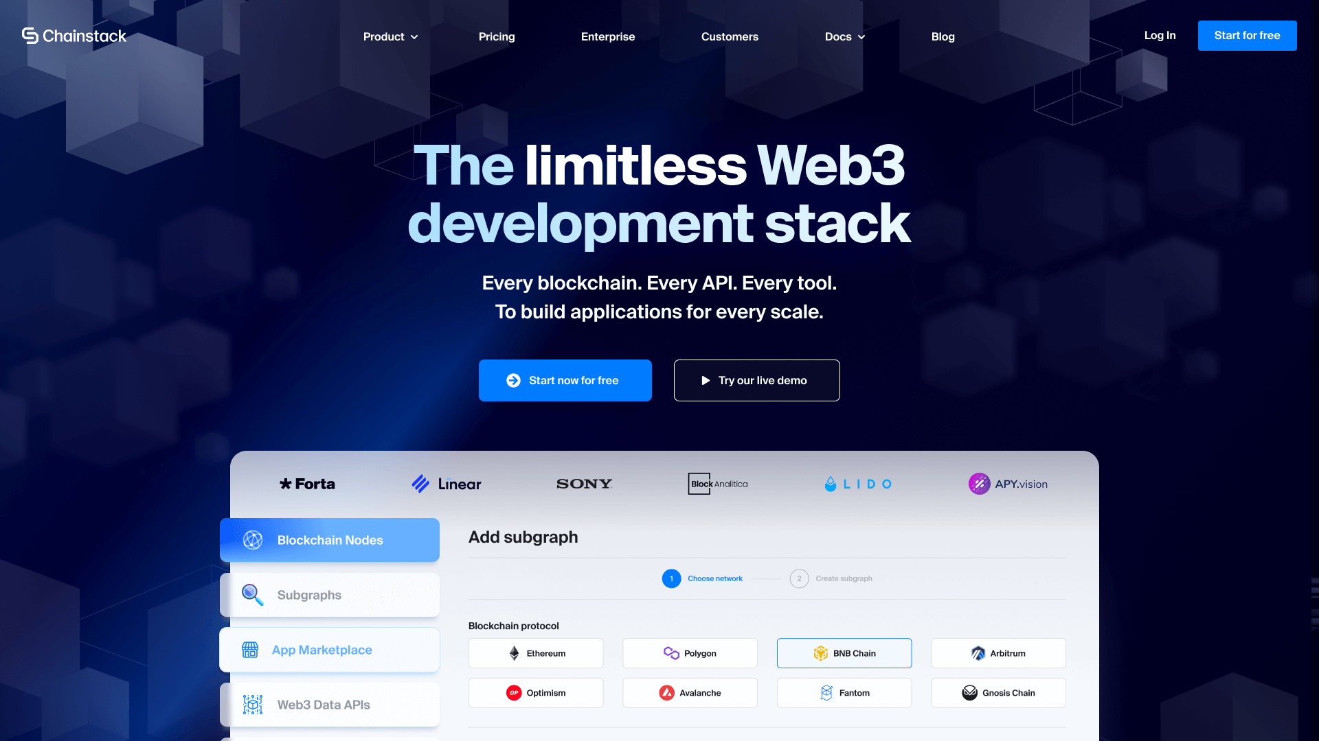
Defining the “What”
Clearly and objectively stating who we are and what we provide: A development stack for Web3 developers
Showing the Product
Unlike most B2B products, we gave prospects easy access to see and “feel” the product with a no-code interactive demo powered by Navattic.
Social Proof Galore
Showcasing customer logos prominently within a UI mockup of our product.
Showcasing Our Offerings
Immediately putting focus on what you, as a user, can expect to find inside the product with an interactive product mockup. From Blockchain Nodes to Web3 Data APIs, and more.
Above: The new homepage hero section. Hover over the numbered hotspots to learn more.
REQUIREMENT
Data showed that only ~20% of our site visitors scrolled past 50% of the page-length. This meant we needed to make a direct and clear impression in 1 glance. We needed our hero section to objectively showcase the following above-the-fold:
- The main positioning statement
- Clarification of what we offer
- The product
- The portfolio of services available inside the product
- Social proof in the form of customer logos
Now, how do we squeeze all of that into just the hero section alone? 😱
DELIVERED
01
The big, bold “what”
Right off the bat, the hero section clarifies the platform and the offerings with the headline and the sub-header as discussed above.
02
Product-focused CTAs
Start using the product right now. Don’t wanna commit before seeing and experiencing the product? Try an interactive demo. Introducing this demo improved our visitor-to-signup conversion by more than 12%.
03
Embedded social proof
We embedded a row of customer logos right inside the product UI mockup. And also had them switch based on the service a user selects from the left.
04
Visually representing our offerings
”Every blockchain. Every API. Every tool.” wasn’t clear? Didn’t read? No problem. We made sure that not only did we present our product in larger-than-life glory, but the sidebar made you see and understand every service offering inside the product.
STEP 3
Amplifying the brand’s differentiation
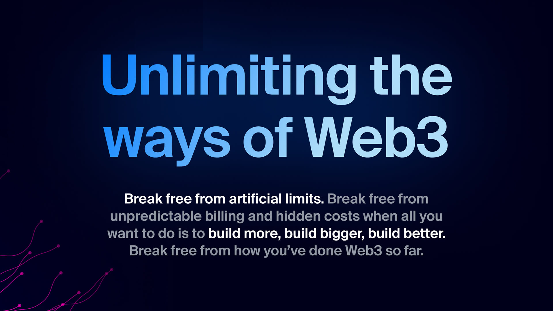 01: The brand’s pricing and “limitless” differentiation
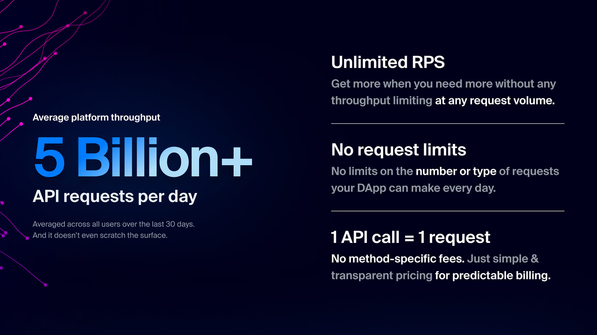 02: Value propositions deemed critical by our ICP
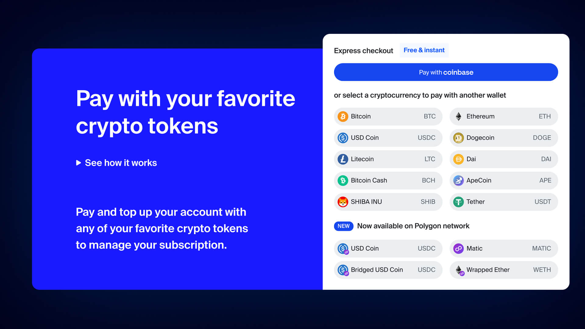 03: Greater freedom, aligned with the brand’s “limitless” philosophy
WHY IT WORKS
01
Speaks to our ICP’s pain points and their past experiences with other infra providers while substantiating our vision of #Web3forAll
02
Clearly addresses their top burning questions, i.e., RPS limits, billing mechanism & predictability, and the “how” of fulfilling these promises
03
Showcases “unlimited flexibility” in managing their billing and payments via any method they preferred—fiat or their favorite tokens.
STEP 4
Educating with what truly matters
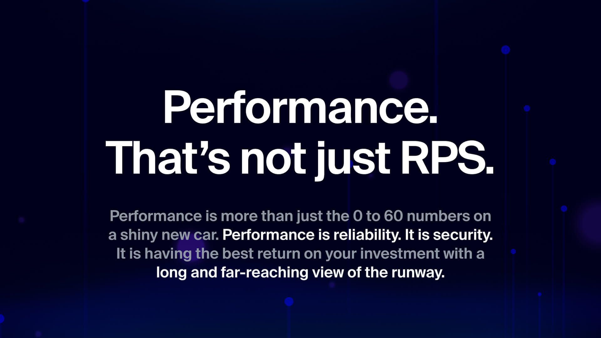 01: Educating users to see past inflated advertised metrics
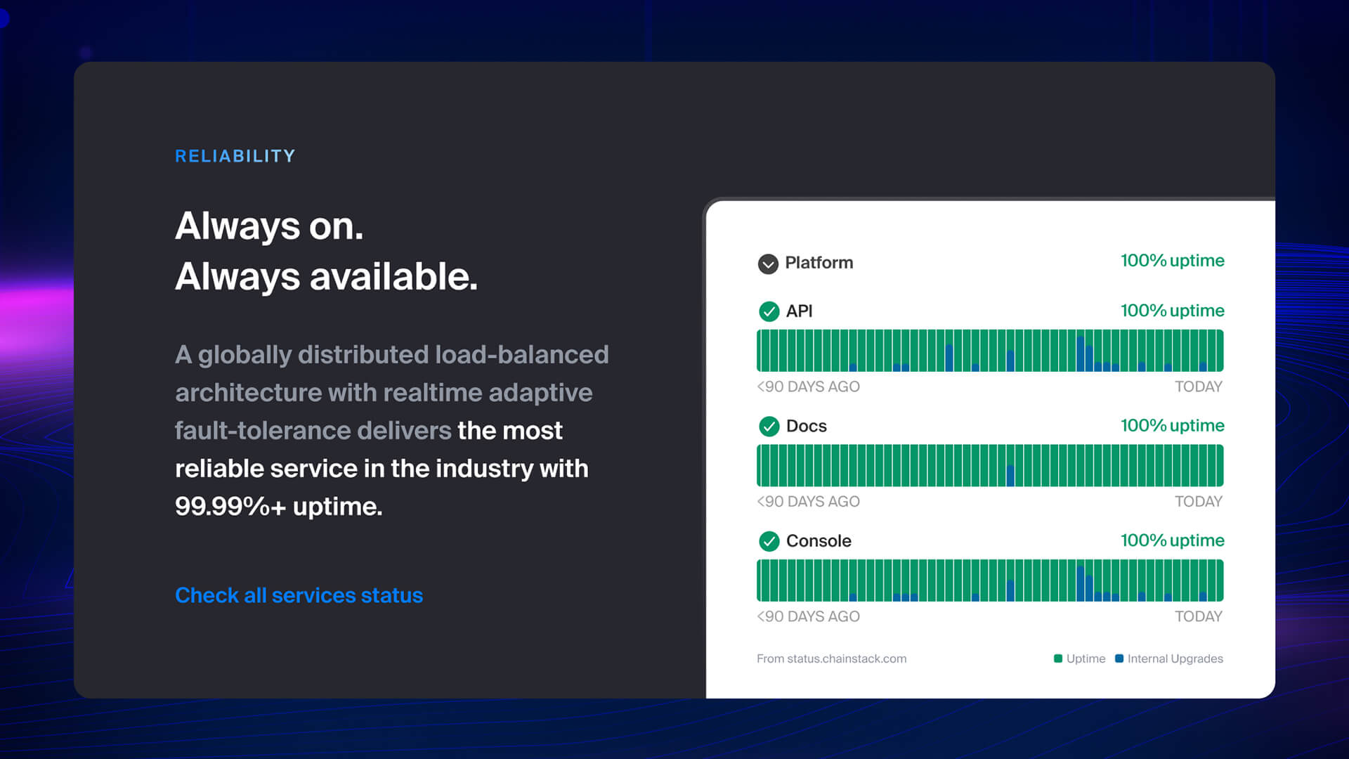 02: Adding substance to claims
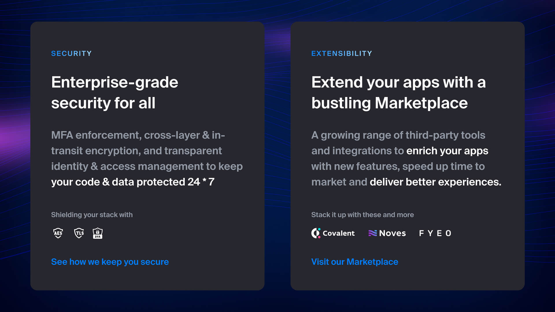 03: Substantiating education with extensibility
WHY IT WORKS
01
Creates trust by educating prospects to look beyond shiny advertising and vanity metrics and understand that “performance” is not one-dimensional
02
Provides visual proof and openly invites prospects to check the veracity of the claims being made for themselves
STEP 5
Branding the taxonomy
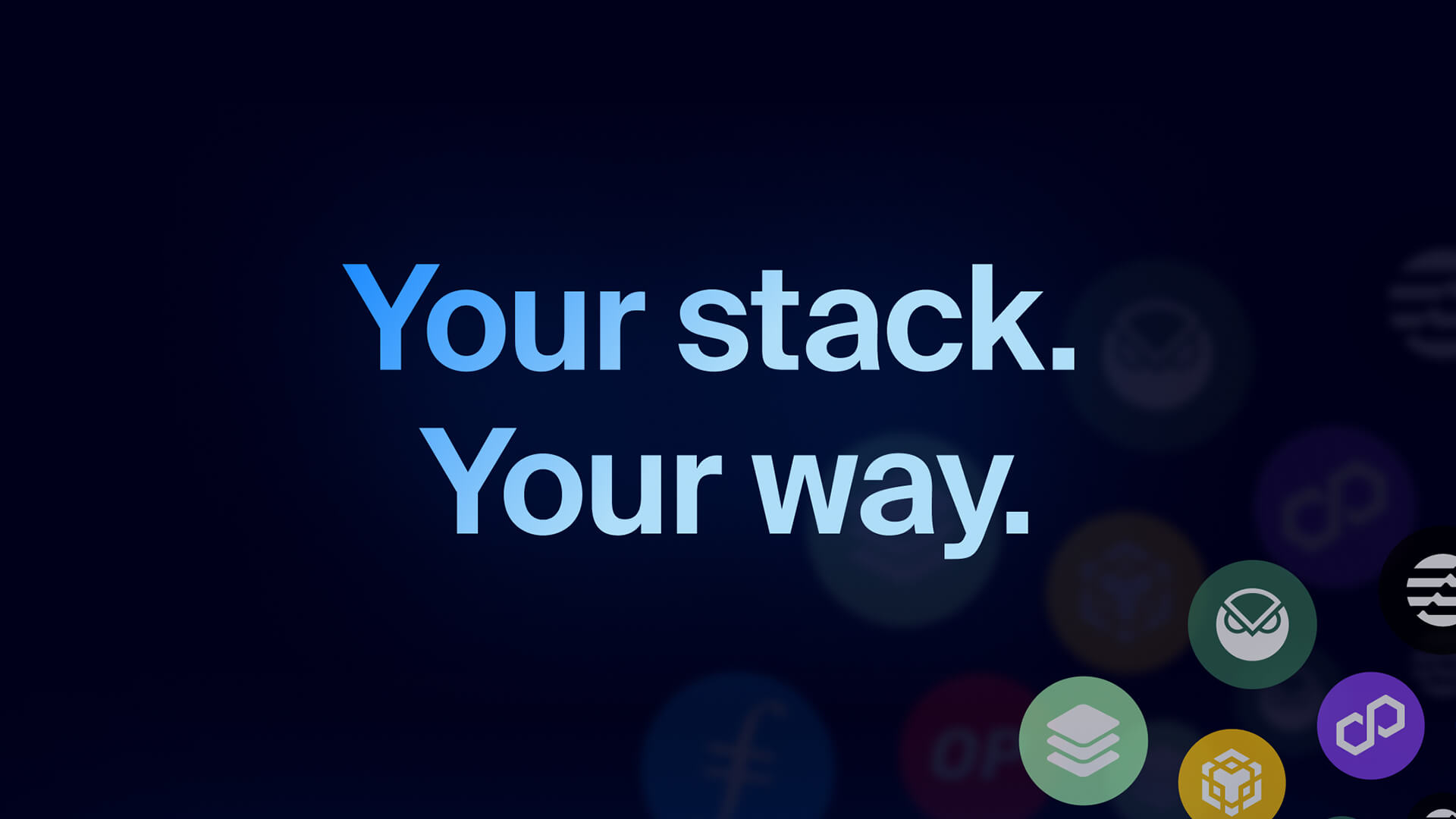
“Stack”-ing it
Actioning the brand name to convey various narratives
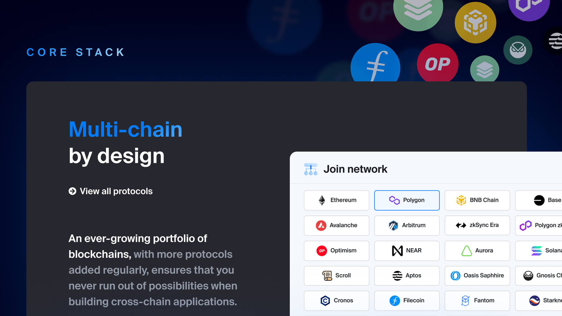
Core “Stack”
Branded nomenclature for fundamental infrastructural offerings like blockchain nodes, appchains, and faucets.
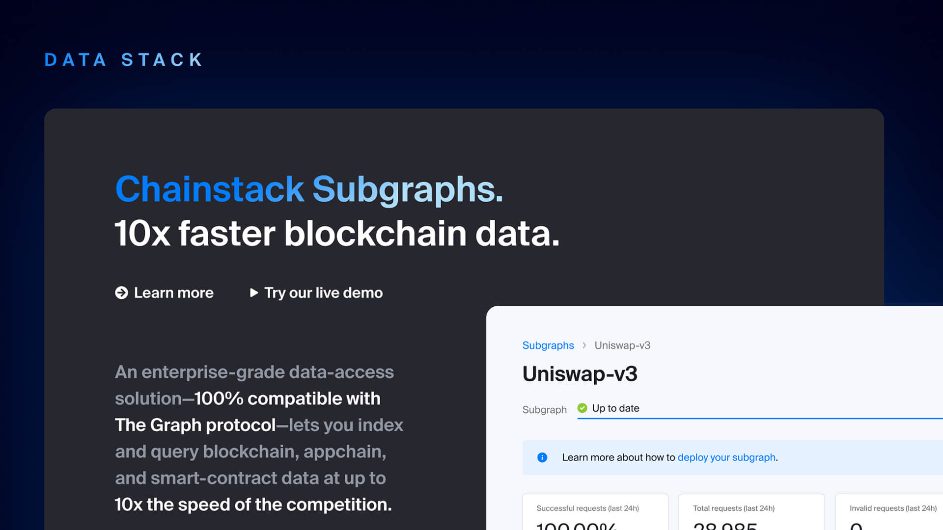
Data “Stack”
Branded nomenclature for data indexing and querying related offerings such as Chainstack Subgraphs, DeFi API, NFT API, etc.
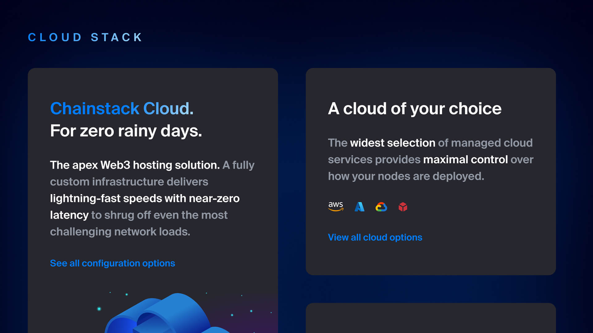
Cloud “Stack”
Branded nomenclature for our cloud configuration services and hosting options.
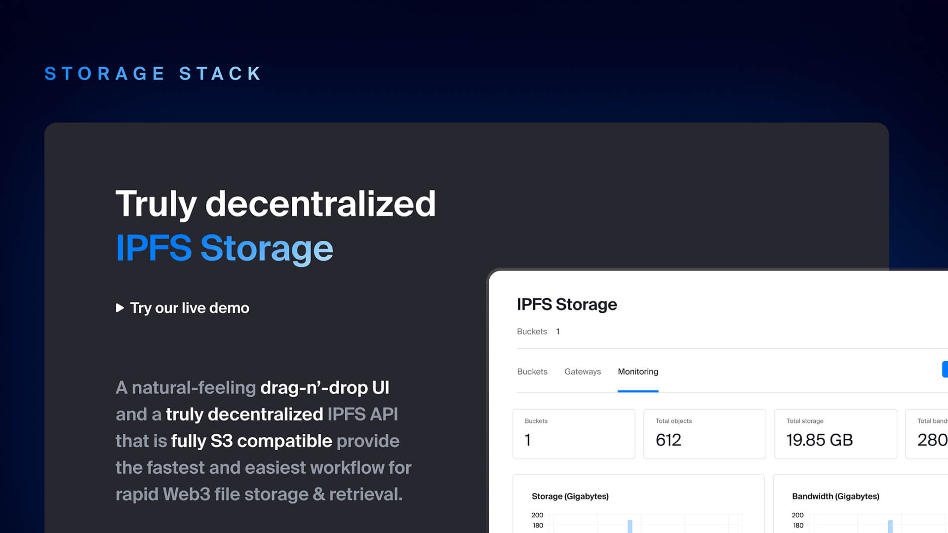
Storage “Stack”
Branded nomenclature for our decentralized IPFS file storage offerings.
WHY IT WORKS
01
Creates recall and cohesion by actioning the brand’s name itself into the taxonomy and nomenclature of its service offerings — “Your stack. Your way.”, “Core Stack”, “Data Stack”, etc.
02
Primes and prepares the brand for all future GTM efforts and creates a mental connect between itself and the community
STEP 6
Concluding with predictability
 01: Closing the brand narrative loop with price predictability and transparency
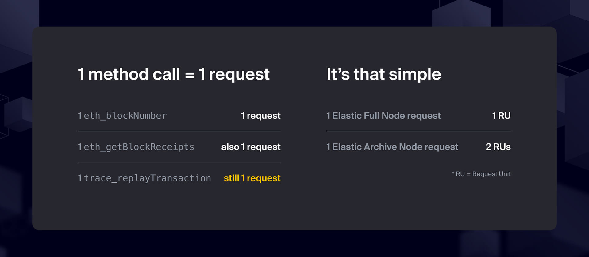 02: Outright proving the claim and making the industry take notice
WHY IT WORKS
01
Takes its due space and time to comprehensively address the ICP’s biggest pain point alongside their primary “RPS limits” concern
02
Showcases the mechanism of how the “transparency’ in pricing works while subtly calling out the competition and prospects’ past experiences with them
IN A NUTSHELL
Conclusion
01
Strategically re-positioned the brand and transformed its market presence from a challenger to a category leader
02
Directed a full visual language refresh and revamped the brand’s narrative and product taxonomy framework
03
Educated & met customers’ expectations improving every engagement and performance metric across the board