

Case Study
Monotype Fonts Digital Customer Onboarding
Crafting personalized in-product experiences to improve activation, utilization, and time-to-value.
Quick summary.
Designed and launched a self-serve digital user-onboarding framework for Monotype Fonts using interactive product tours personalized for key personas — creative users, administrative users, and individual evaluators.
Well that was a treat logging into Monotype Fonts this morning. I thought the pop-up video and the run-through of the new My Library features was excellent and a great way to showcase to our users what’s now available to them.
The objective.
Create a scalable, personalized framework to digitally onboard Monotype Fonts users in a self-serve manner.
About the product
Monotype’s premier font subscription service for the creatives of the world—Monotype Fonts—is an ever-expanding library of iconic typefaces from some of the most renowned type foundries, with AI-powered visual font-discovery tools, single-point font & licensing management, complete with team sharing & creative collaboration features.
My role
As the Product Marketing Manager for Monotype Fonts, I led the efforts in researching and evaluating digital tools available for the task, strategizing the customer journey, UX design and content, and user-testing with both, internal and external stakeholders.
Requirements & background.
For Monotype Fonts, we’d been using Appcues for some time for things like feature release announcements, event and webinar updates, etc.
And while we’d seen users engaging well with the content, these announcements and guides needed to be structured by priority, consolidated in design, and turned into a unified, scalable framework for the customers’ onboarding experience: from their first-login, to being able to recall help as needed.
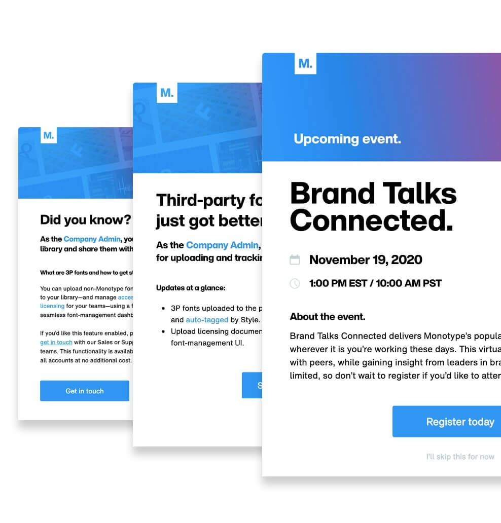
Above: A few pre-existing announcement & user-update screens
Learnings
- Data from our existing Appcues flows showed the highest drop-off after the 4th step in multi-step tours on average.
Creating the requirement-set
- Based on the above, it was critical to have the fewest number of steps possible in product tours. Which meant creating multiple bite-sized tours that could be cross-triggered based on user-intent.
- Users MUST be able to choose their own journey as the product serves multiple personas with different motivators after logging in.
- Onboarding guidance must be non-intrusive. Users must be able to skip things entirely if they so chose.
- Super important: Users must be able to relaunch guide content should they require help at any time even if they’d chosen to skip initially.
Building the experience.
01—
Designing the user journey
Our product served 2 main personas: the Creatives and the Administrators. And a third was to be introduced soon: the Trialers. More on that coming soon.
Now, Trialers naturally got access to both Creative and Admin features. It was, therefore, the right segment to start visualizing the journeys and the content for. Doing so also meant it would be easier to subset this content later on for the more role-specific personas.

Above: Using branched product tours to map out high-level user journeys
02—
Creating high-fidelity on-brand mockups
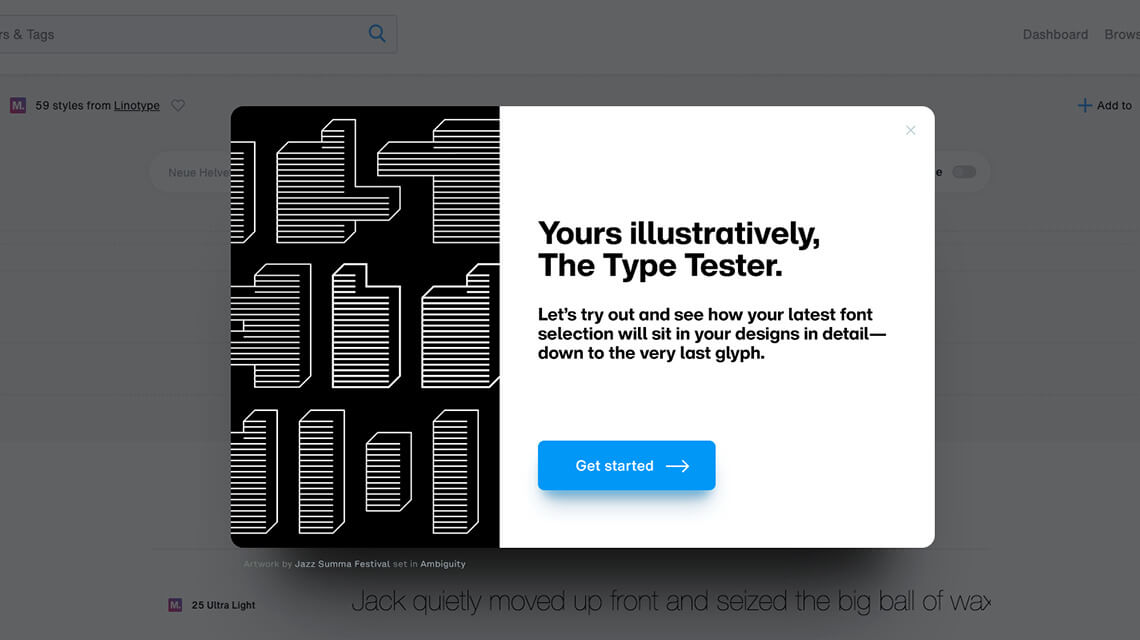
With a clear-enough map of the user journeys, I moved on to designing mockups for some of the key widgets and tone-setting modal screens at the beginning of key tours. For a design-centric company with a SaaS product made for the creatives of the world it’s only fair for the product tours to also reflect that. Right?
Not only is the objective ensuring brand consistency across all experiences, but most of all — delight. With delightful experiences comes engagement, and therefore, education, and every other metric we all like to track as product leaders.
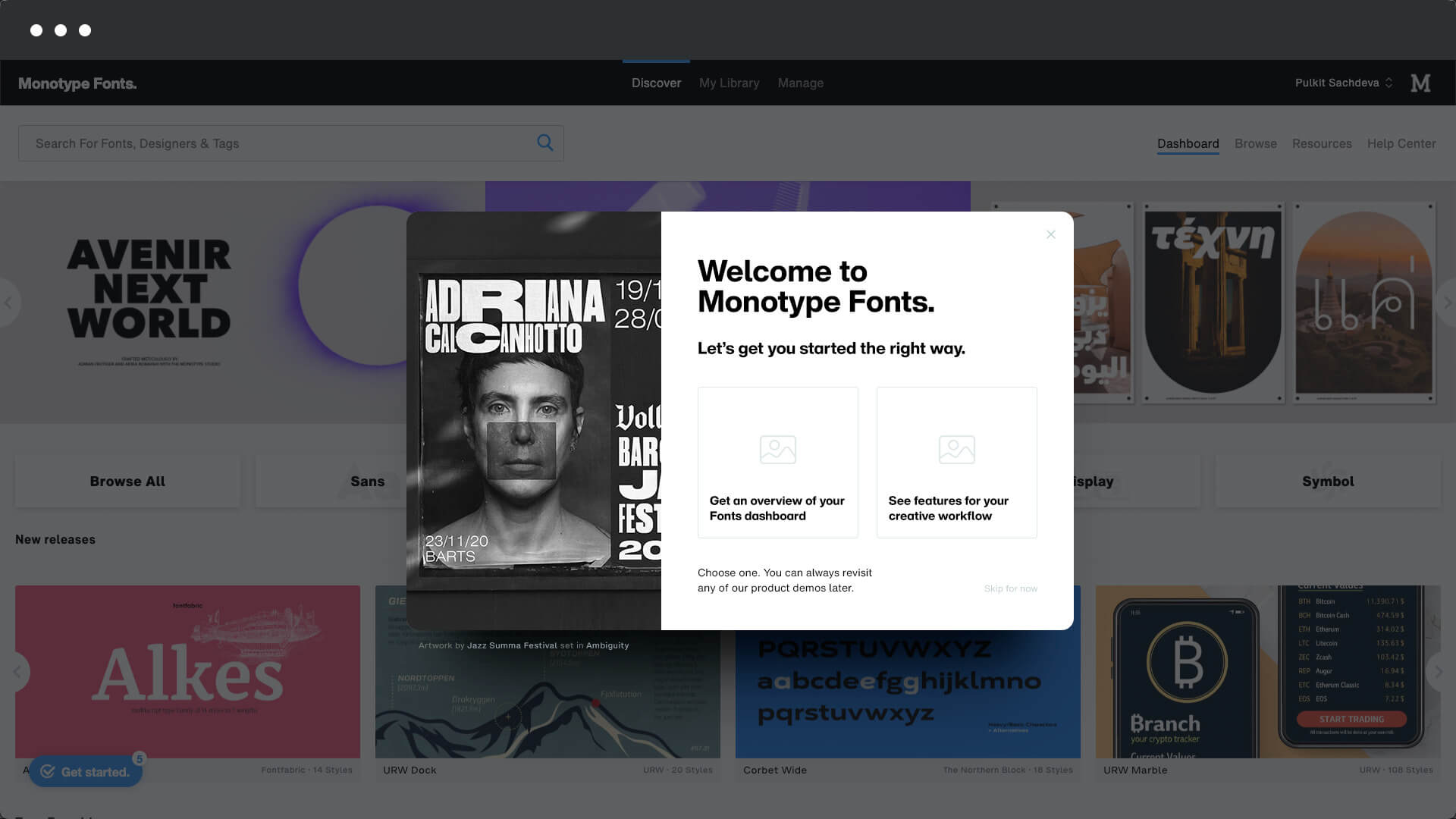 Mock-up: First-login welcome modal
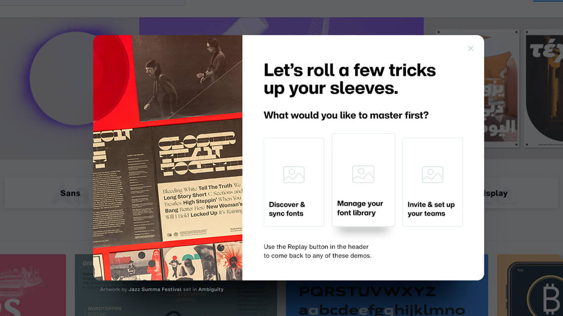
Mock-up: Feature demo selector modal
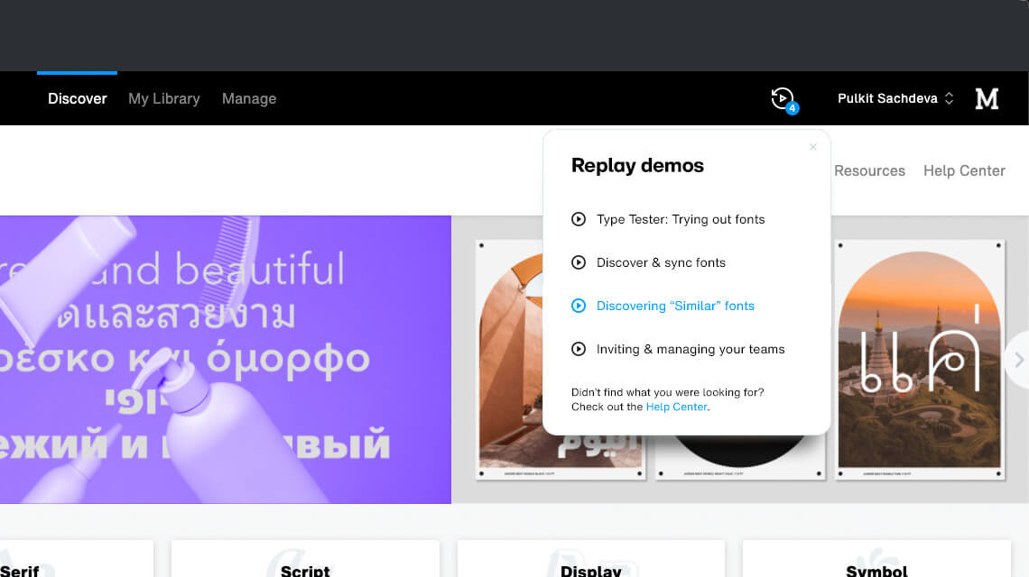
Mock-up: Widget to relaunch demos on-demand
Mock-up: Section intro modal
03—
Developing customizations
Once the initial design vision was ready, I hired a front-end developer from Upwork to help customize Appcues’ default patterns and mould them to the new designs.
We added code to the theme and inline styles in tooltips and modals to enable:
- An image-slideshow/animation container on the left
- Large navigation buttons with icons
- Various design elements and micro-interactions for smaller CTAs
Above: First-login welcome screen with the design customizations implemented
04—
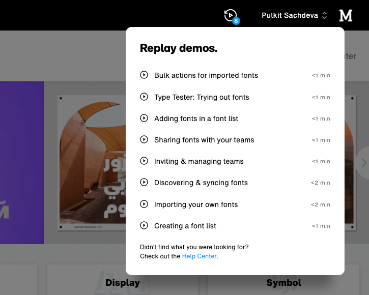
Enabling on-demand recall
Being non-intrusive was a hard requirement, and so, it was necessary to have a way for users to relaunch product tours on demand.
For this, I customized the design of the Appcues relaunch widget and worked with engineering to have it trigger on click of a new ”Replay” icon in the product header.
We even added little time estimate markers to assure users their time was valued.
05—
Assuring users ”we’re there”
Despite one’s best-intended efforts, the reality is that most users logging into your product will naturally ”skip” in-app cues. I get it. I do too.
So, I ensured that even the ”skip” was meaningful and that it would trigger one final little game-like tooltip assuring them that help is available should they ever need it.
The CTR for the Replay button has consistently hovered around 30% since the launch. It also provides an awareness advantage by showing users an at-a-glance list of available features.

06—
Testing things out
With all the Appcues flows ready in English, it was time to roll it out internally with a cross-functional team with members from Product, Marketing, Customer Success, and Customer Support to check for value-addition and factual correctness.
07—
Localizing content for the launch
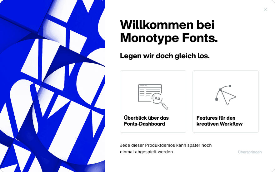
Once approved for English, I began localizing the content in German and French.
For this, I used DeepL to do most of the translation-heavy lifting, while some of my amazing peers stepped in to review and edit whatever it didn’t get right. 🤗 🙌
With this bit done, we were all set to launch.
The end-product.
Example journey 01
Onboarding Creative users
Here you can see a multi-flow experience to onboard creative users allowing them to choose their own path. The journey shows a few bits of information while pausing regularly in-between to ask and provide options based on what a user may find relevant.
Example journey 02
Providing recall
Here you can see the initial onboarding screen being skipped which triggers a tooltip assuring users that help is available on-demand and in-product guides can be ”replayed” at any time.
Example journey 03
Relaunching a demo
A guided feature-demo being launched from the ”Replay” menu.
Example journey 04
Administrative demo
Guided feature-tour personalized for Administrative users.
Example journey 05
Font library demo
Organization features tour for both Creative and Administrative users.
From the Customers
Well that was a treat logging into Monotype Fonts this morning. I thought the pop-up video and the run-through of the new My Library features was excellent and a great way to showcase to our users what’s now available to them.
— Andy Thorpe
Asset Management @ Pearson
The results.
01.
Post-launch, an average of 40% of the Monthly Active Users (roughly 50%+ trialers and 30% existing customers) engaged with the guided journeys to reach key activation-points faster.
02.
The above led to greatly reduced Time-To-Value with the new onboarding journeys facilitating activation as much as 6.7x faster.
03.
Over time, 30% of all users engaged with the custom-designed Replay widget to relaunch product demos successfully making it an on-demand, non-intrusive, education tool.